What Are Icons?
Definition and Importance of Icons
Icons are graphical representations that convey meaning and facilitate interaction within digital interfaces. They serve as visual shorthand, enabling users to understand the function or message of an element quickly. The significance of Icons lies in their ability to enhance usability, improve navigation, and create aesthetically pleasing designs. Rather than relying solely on text, icons provide a universal language that can transcend linguistic barriers, making them essential in today’s globalized digital landscape.
Different Types of Icons
Icons can be categorized into several types based on their function and design:
- Action Icons: Represent specific functions like saving, sharing, or deleting. For example, a floppy disk symbolizes saving.
- Navigation Icons: Aid in guiding users through an interface, such as arrows indicating direction or a map pin marking a location.
- Social Media Icons: Represent various social platforms, engaging users to connect, share, or follow. These icons often feature their brand colors and stylized designs.
- Brand Icons: Utilize logo designs to promote brand identity and recognition, enabling consumers to associate products or services with familiar images.
Contextual Usage of Icons
The effectiveness of icons relies heavily on context. Within user interfaces, icons must be selected and designed thoughtfully to align with the overall aesthetic and function of the system. For instance, a shopping cart icon is appropriate for e-commerce sites, while a home icon is effective for navigation on websites. Additionally, using familiar shapes that match commonly recognized actions enhances user experience and accessibility.
Design Principles Behind Icons
Simplicity and Clarity in Icon Design
Icon design should prioritize simplicity and clarity. Overly complex icons can confuse users and detract from usability. Effective icons are easy to interpret at a glance and should convey their intended message without unnecessary embellishments. Simplified designs ensure recognition across varying sizes and resolutions, maintaining their effectiveness in different contexts.
Color Theory Applied to Icons
Color plays a critical role in icon design. Different colors evoke specific emotions and perceptions. For example, green often signifies ‘go’ or ‘safe,’ while red conveys ‘stop’ or ‘danger.’ When incorporating color into icons, designers should consider their target audience and the psychological impact colors create. Additionally, maintaining a consistent color palette across icon sets fosters brand coherence and enhances aesthetic appeal.
Typography and Icons: A Harmonious Relationship
In many instances, icons are paired with text to provide additional clarity. The choice of typography can greatly influence the overall impact of an icon. Fonts should be legible, complement the icon’s style, and maintain visual balance. Designers must ensure that text does not overcrowd the icon, retaining the clarity and recognizability of both elements.
Best Practices for Utilizing Icons
Choosing Icons for User Interfaces
The selection of icons in user interfaces should be carefully considered. It’s crucial to choose icons that users can swiftly understand. Testing conduct peer reviews and user feedback can help identify the icons that resonate best with the target audience. Additionally, adapting icons for cultural relevance is essential because the meaning of icons can differ across cultures.
Consistency Across Icon Sets
Consistency across an icon set promotes a cohesive user experience. Designers should maintain uniformity in size, style, and color across all icons within an interface to create harmony. This not only aids in recognition and comprehension but also strengthens the overall aesthetic of the product being designed.
Accessibility Considerations for Icons
Making icons accessible is crucial for inclusive design. Consider the following best practices:
- Alt Text: Provide descriptive alt texts for icons used on websites to assist users with screen readers.
- Contrast: Ensure sufficient contrast between icons and their backgrounds to accommodate users with visual impairments.
- Size and Spacing: Icons should be large enough and spaced adequately to avoid accidental clicks and enhance usability for all users.
Creating Custom Icons
Tools and Software for Icon Design
Creating custom icons requires reliable design tools and software. Popular options include:
- Adobe Illustrator: A premier vector graphic design tool perfect for detailed, scalable icons.
- Sketch: Widely used among UX/UI designers, Sketch excels in icon and user interface design.
- Figma: A collaborative interface design tool that allows for real-time teamwork and access to shared resources.
- Inkscape: A free alternative for vector graphic design, suitable for budget-conscious designers.
Steps for Designing Unique Icons
When designing unique icons, consider the following steps:
- Research existing icon trends and styles.
- Sketch initial concepts based on specific use cases.
- Digitize the sketches using your chosen design software.
- Iterate based on feedback from potential users and stakeholders.
- Finalize icons by ensuring they meet quality and usability standards.
Testing and Iterating Icon Designs
Testing is essential for ensuring icons are effective and user-friendly. Conduct usability tests with diverse user groups, observing their interactions with the icons. Utilize A/B testing methods to compare variations and gather quantitative data on their performance. This iterative process allows for continuous improvement of the icon designs.
Future Trends in Icon Design
Impact of Technology on Icon Usage
As technology evolves, the usage of icons is also transitioning. With the rise of mobile applications and web applications, icons are adapting to responsive design, needing to function well on various devices and screen sizes. Additionally, advancements in artificial intelligence and machine learning are paving the way for dynamic icons that can change based on user interactions or preferences.
Emerging Styles in Iconography
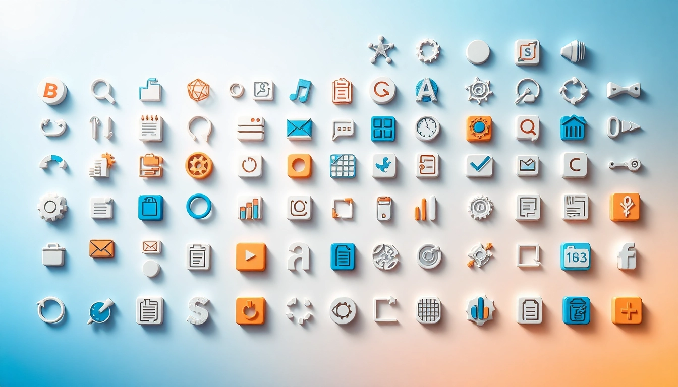
Icon styles are continuously evolving. Currently, we see a trend towards minimalism, where designs are stripped to their essential elements, promoting ease of understanding and quick recognition. Flat design remains popular, emphasizing clean lines and vibrant colors. However, there is also a growing appreciation for 3D icons, offering depth and realism, especially in virtual and augmented reality environments.
Icons in Multi-Platform Environments
With the proliferation of various platforms, icons must be adaptable and consistent across devices. Designers are increasingly creating icon sets that look good on both mobile and desktop applications, ensuring brand consistency and user familiarity. The use of vector graphics facilitates this adaptability, allowing icons to maintain their visual quality no matter the size or medium.